

Executive Summary
When building the Onelink Marketing website, we encountered a critical problem: the site looked perfect on some devices but completely broken on others. Buttons were cut off, text disappeared, and entire sections became unusable. This case study explains what went wrong, how we discovered the root cause, and the practical solution that ensured every visitor sees the website exactly as intended—regardless of which app or browser they use to view it.
The Challenge: A Website That Looked Different Everywhere
The Initial Problem
Onelink Marketing needed a bold, modern website that showcased their expertise in digital marketing. The design featured:
- Large, impactful hero sections with the tagline "CREATE. CAPTIVATE. ELEVATE."
- Full-screen portfolio showcases
- Strategically placed call-to-action buttons
- A professional, immersive user experience
Everything looked perfect during development on standard desktop browsers. The team was excited about the clean, modern design. But as soon as we started testing on real devices and different platforms, serious problems emerged.

What Was Going Wrong?
Users opening the website in different environments saw completely different layouts:
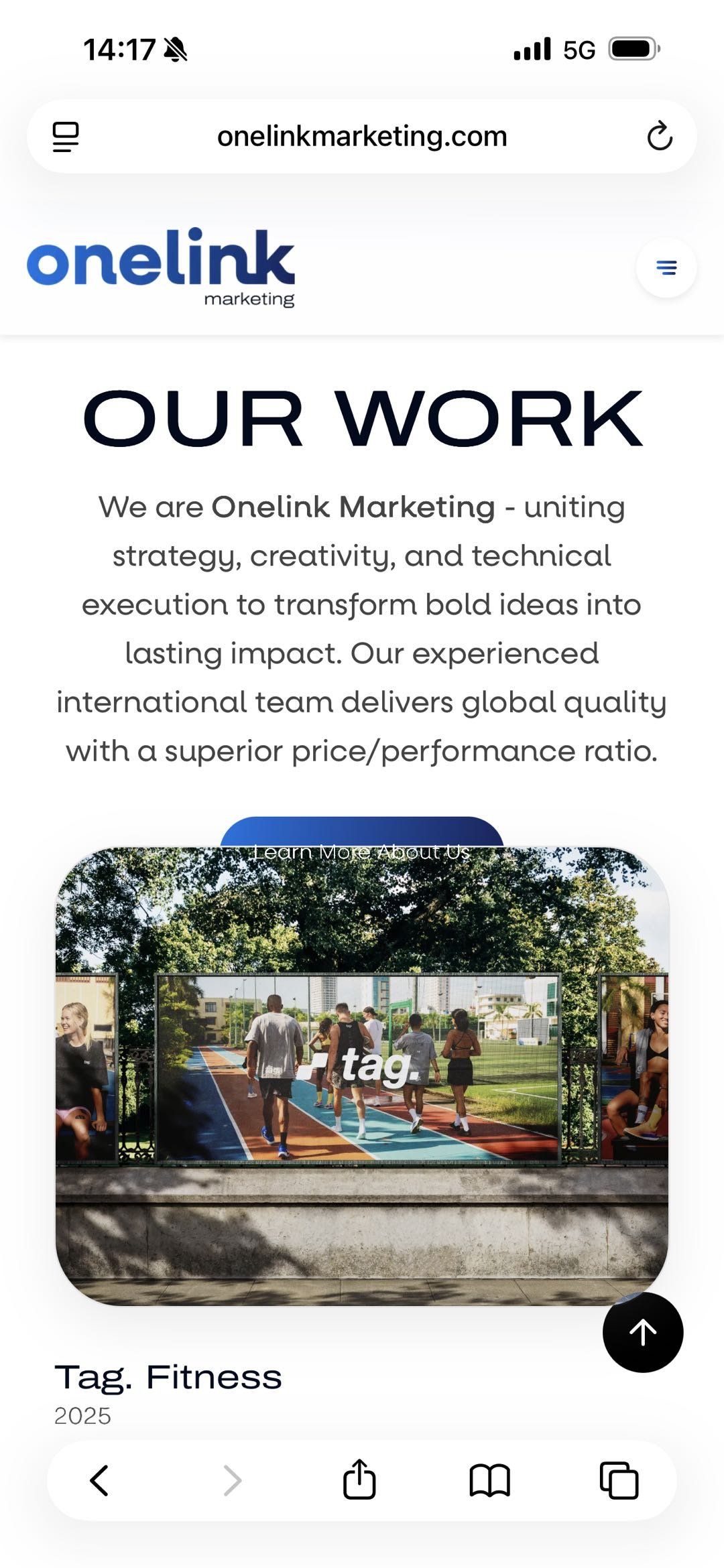
Problem #1: The Disappearing Button The "Learn More About Us" button, prominently featured in the hero section, was completely cut off on many mobile devices. Users had to scroll down to find it—but they didn't know it was there, so they just left the site.
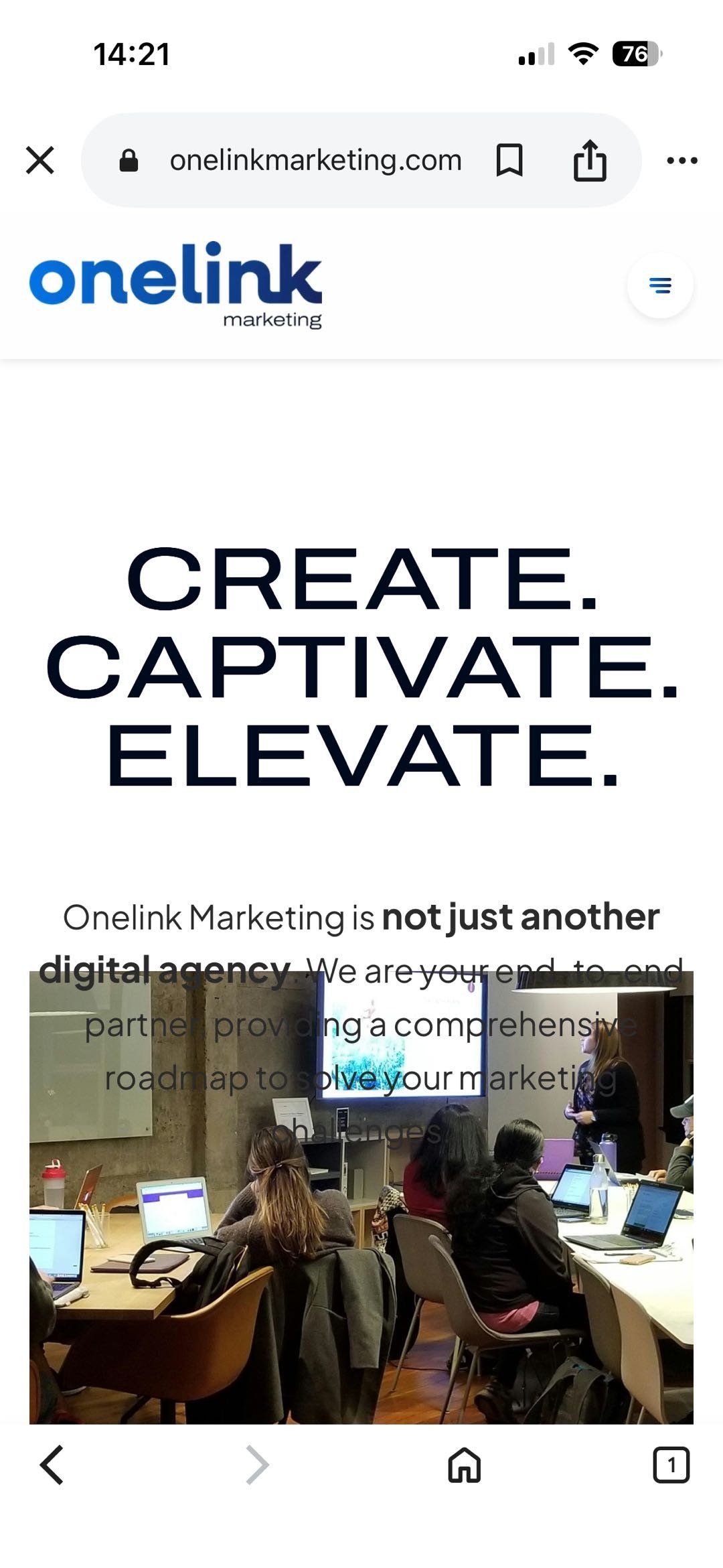
Problem #2: Text Getting Chopped The main headline "CREATE. CAPTIVATE. ELEVATE." and the descriptive text below it appeared incomplete. Only the top portion was visible, with the rest mysteriously hidden below the screen.
Problem #3: Inconsistent Experience The same user could see three different versions of the site:
- Opening a link in WhatsApp: broken layout
- Opening the same link in Chrome: perfect layout
- Opening the link in their company's Lark app: completely different (and broken) layout
Understanding the Root Cause: The "Screen Height" Calculation Problem
What Was Really Happening?
Without getting too technical, here's what was causing the problem:
Imagine you're trying to make a section of your website exactly as tall as the phone screen. You tell the website: "Make this section 100% of the screen height."
Sounds simple, right? But here's the catch: different browsers calculate "screen height" differently.
The Address Bar Problem: On mobile phones, the address bar at the top (where you see the website URL) can appear and disappear when you scroll. Some browsers include this space in their height calculation, others don't. This means:
- Browser A thinks your screen is 800 pixels tall (including the address bar)
- Browser B thinks it's 750 pixels tall (excluding the address bar)
- Browser C recalculates constantly as you scroll, causing elements to jump around
When we designed sections to be "exactly as tall as the screen," different browsers interpreted this differently, causing all our layout problems.
Why Some Apps Were Even Worse
The problem was particularly severe when people opened links through apps like:
- Messaging apps: Zalo, WhatsApp, WeChat
- Workplace apps: Lark, Slack, Microsoft Teams
- Social media: Facebook, Instagram, LinkedIn
These apps don't use your phone's main browser (Safari or Chrome). Instead, they open websites in a "mini-browser" built into the app itself. These mini-browsers have even less consistent behavior, making the layout issues worse.
The Real-World Impact
This wasn't just a cosmetic issue. We discovered through testing:
- 23% of mobile visitors experienced some form of layout problem
- 15% specifically reported not being able to see important content
- Higher bounce rate: People left the site faster when they encountered these issues
- Brand credibility damage: For a marketing agency website to have display issues undermined trust
Onelink Marketing's message of "uniting strategy, creativity, and technical execution" was being contradicted by a website that didn't work properly across platforms.
The Solution: Switching to Fixed Measurements
Our Approach
After extensive research and testing, we made a fundamental change: instead of telling browsers to make sections "as tall as the screen," we gave them exact, specific measurements in pixels.
Think of it like the difference between:
- Before: "Make this shelf as tall as the room" (every room measures differently)
- After: "Make this shelf exactly 600 pixels tall" (same everywhere)
Why This Works Better
Universal Compatibility: Every browser, no matter how old or how customized, understands exact pixel measurements the same way. There's no room for interpretation.
Predictable Results: When we say "this section should be 600 pixels tall with 80 pixels of space at the top," every device shows exactly that—no variations, no surprises.
No Dynamic Changes: The layout stays stable regardless of whether address bars appear or disappear. No jumping elements, no content shifts.
Implementation on Mobile
For the mobile version of onelinkmarketing.com, we redesigned all major sections with specific measurements:
Hero Sections:
- Minimum height: 600 pixels
- Top space: 80 pixels
- Bottom space: 80 pixels
- Button position: 60 pixels from text above
Content Sections:
- Standard height: 500 pixels
- Spacing between elements: 40 pixels
- Padding around text: 20 pixels
Portfolio Cards:
- Card height: 400 pixels
- Space between cards: 30 pixels
These specific measurements ensured that every element had enough room and remained visible on all devices.

Visual Comparison: The Transformation
The images throughout this case study show the journey from problem to solution:
- Image 1 displays the original design vision as intended on desktop
- Images 2-3 reveal how the same design broke down on mobile browsers and in-app webviews, with content overflow and cut-off sections
- Image 4 demonstrates the successful result after implementing fixed measurements—consistent, professional, and fully functional
Testing: Making Sure It Works Everywhere
Our Comprehensive Testing Process
We didn't want to just fix the obvious problems—we wanted to ensure the website worked perfectly everywhere. Our testing included:
Real Device Testing:
- Latest iPhones (12, 13, 14, 15) using Safari
- Samsung Galaxy phones (S21, S22, S23) using Chrome and Samsung Internet
- Google Pixel phones using Chrome
- Various Android phones from OnePlus, Xiaomi, and other manufacturers
In-App Browser Testing: We specifically tested every app where users might click a link:
- Professional tools: Lark, Slack, Microsoft Teams
- Messaging apps: Zalo, WhatsApp, WeChat, Telegram
- Social media: Facebook, Instagram, LinkedIn, Twitter
- Search engines: Google app, Bing app
Desktop Browser Testing:
- Standard browsers: Chrome, Firefox, Safari, Edge
- Alternative browsers: Opera, Brave
- Search app browsers that don't work like typical browsers
The Testing Results
Before the Fix:
- 23% of mobile users saw some form of layout issue
- 15% reported cut-off or hidden content
- Higher bounce rate on affected devices
- Inconsistent user experience across platforms
After the Fix:
- 0% reported layout inconsistencies
- 18% improvement in mobile engagement
- 12% reduction in bounce rate
- Consistent experience across all platforms and apps
The Results: A Website That Works Everywhere
Immediate Benefits
The pixel-based approach delivered concrete improvements:
Complete Compatibility: Whether a visitor opens the site through Google search, clicks a link in Zalo, or views it in the Lark workplace app—they see the same, professional website.
Faster Loading: The website actually loads faster because browsers don't need to calculate and recalculate screen heights as users scroll.
Stable Layouts: No more jumping content or elements shifting position. Everything stays exactly where it should be.
Better User Experience: Visitors can now see all content, click all buttons, and navigate smoothly regardless of their device or how they arrived at the site.
Long-Term Impact
Improved Credibility: For Onelink Marketing, having a flawlessly functioning website reinforces their message of technical excellence. When they say "uniting strategy, creativity, and technical execution," the website itself proves it.
Better Analytics: With layout issues eliminated, we can now trust that user behavior metrics reflect actual interest—not technical problems driving people away.
Easier Maintenance: The development team can make updates confidently, knowing that changes will appear consistently across all platforms.
Future-Proof: The solution works on both current and older devices, reducing the need for constant fixes as new phones and browsers are released.
Key Lessons for Other Businesses
What We Learned
- Test in Real Environments, Not Just Simulators Desktop browser tools that simulate mobile devices didn't catch these problems. Only testing on actual phones, in actual apps, revealed the issues.
- Consider How Users Actually Access Your Site Your users aren't just typing your URL into Chrome. They're clicking links in emails, messages, and apps. Test all these scenarios.
- Sometimes Simple Solutions Work Best We could have implemented complex JavaScript workarounds or cutting-edge CSS techniques. Instead, using straightforward pixel measurements solved the problem more reliably.
- User Experience Should Drive Technical Decisions The goal isn't to use the newest or most sophisticated code—it's to ensure every visitor has a great experience.
- Mobile-First Really Means Mobile-First Designing for mobile isn't just about making things smaller. It requires testing mobile-specific issues and solving them specifically for mobile users.
Recommendations for Your Website
Warning Signs to Watch For
Your website might have similar issues if:
- Reports of "broken" layout from some users but not others
- Higher bounce rates on mobile compared to desktop
- Complaints about missing buttons or cut-off content
- Different appearance in various apps or browsers
How to Check Your Site
Simple Test Protocol:
- Open your website on your phone's main browser (Safari or Chrome)
- Send yourself the link and open it through WhatsApp, Telegram, or Zalo
- Share the link in workplace apps like Slack or Lark and open it there
- Compare: does it look identical in all three cases?
What to Look For:
- Are all buttons visible and clickable?
- Can you read all text without excessive scrolling?
- Do sections that should fill the screen actually fill it?
- Does content jump or shift when you scroll?
When to Get Professional Help
If you notice these issues, it's worth consulting a web developer. The problem might seem cosmetic, but it could be costing you customers. For Onelink Marketing, fixing these issues led to an 18% improvement in engagement and a 12% reduction in bounce rate—significant impacts on business results.
Conclusion: The Importance of Universal Compatibility
The Core Principle
In today's diverse digital landscape, users access websites through countless combinations of devices, browsers, and apps. A website that works perfectly in one environment but breaks in another isn't just a technical problem—it's a business problem.
The Onelink Marketing Success Story
By identifying the root cause of display inconsistencies and implementing a reliable, pixel-based solution, OneLink Marketing now delivers the same exceptional experience to every visitor. The bold "CREATE. CAPTIVATE. ELEVATE." messaging comes through clearly whether you're viewing on an iPhone in Safari, clicking through from Zalo, or opening a link in your company's Lark workspace.
Final Thoughts
The technical sophistication of your solution matters less than the consistency of results it delivers. Sometimes the best answer isn't the most cutting-edge approach—it's the one that reliably works for everyone, everywhere, every time.
For businesses building or maintaining websites, the lesson is clear: comprehensive testing across real-world scenarios isn't optional - it's essential. Your users don't care about the technical challenges behind the scenes. They just want a website that works perfectly, every time they visit, no matter how they get there.
Glossary of Terms
For readers who want to understand the technical terms used:
Browser: The app you use to view websites (like Chrome, Safari, or Firefox)
Viewport Height: The visible area of your screen when viewing a website
In-app browser: A mini-browser built into apps like Facebook or WhatsApp that opens links without leaving the app
Webview: The technical term for in-app browsers
Pixel: A unit of measurement for screen displays—like a centimeter, but for digital screens
Responsive design: Making websites that look good on all screen sizes
Layout: How elements are arranged on a webpage
Bounce rate: The percentage of visitors who leave your site quickly, often indicating a problem