
About the Project
OneLink Holdings is a diversified business group with operations spanning sourcing, logistics, and manufacturing across Asia. As the company expanded its global reach, its website no longer reflected the scale, professionalism, and innovation of the brand.
They approached OneLink Marketing with a clear goal: To redesign the corporate website into a modern, visually cohesive digital presence that communicates trust, expertise, and forward-thinking energy.
The challenge wasn’t just to make the website look good — it was to translate a complex, multi-service business into a clear, intuitive digital experience that resonated with both partners and international clients.
The Challenge
The original OneLink Holdings website had strong content but lacked a unified brand identity. Key challenges included:
- Outdated visual direction: The old design used inconsistent colors, typography, and layout across pages.
- Weak visual hierarchy: Important messages were buried under dense text blocks and stock imagery.
- Lack of brand emotion: The design didn’t convey the modern, global energy the company had evolved into.
- Navigation friction: Users find it hard to understand the structure of services and navigate between divisions.
The goal was to create a bold, refined, and purpose-driven digital identity — one that looks and feels like a global player.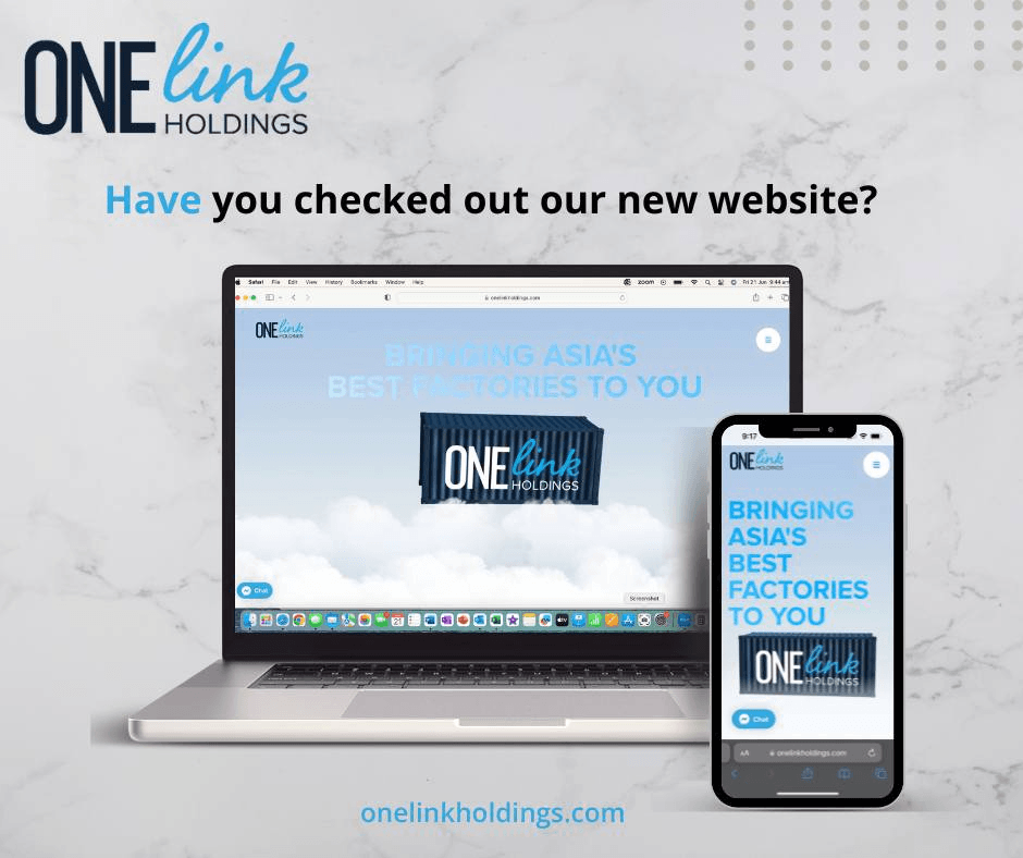
Our Approach
At OneLink Marketing, we believe strong web design starts with strategy. Before sketching a single wireframe, we spent time understanding OneLink Holdings’ brand story, values, and long-term vision.
Our process unfolded in four key stages:
Step 1: Brand Discovery & Design Direction
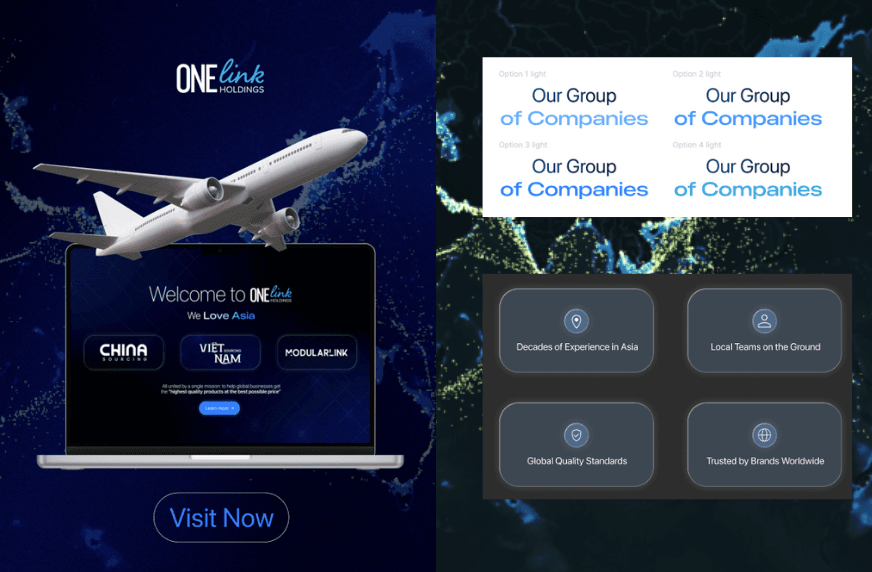
We began with a brand immersion workshop to define the company’s personality, tone, and visual DNA. Together with the OneLink Holdings team, we aligned on three key design pillars:
- Professionalism with warmth: A corporate look that still feels human and approachable.
- Global confidence: Design that communicates scale, credibility, and operational depth.
- Modern simplicity: Minimalist layouts emphasizing clarity, whitespace, and clean structure.
From there, we created a visual style board — refining the palette, typography pairings, and iconography to achieve balance between business authority and visual calm.
Step 2: Information Architecture (IA)
We completely restructured the site map to make content easier to navigate. Each division (Sourcing, Logistics, Manufacturing) was given a distinct visual identity within a unified framework — ensuring users could understand the company’s scope at a glance.
We focused on creating a linear content flow:
- Clear hero messages introducing each business vertical
- Supporting visuals showing real operations and partnerships
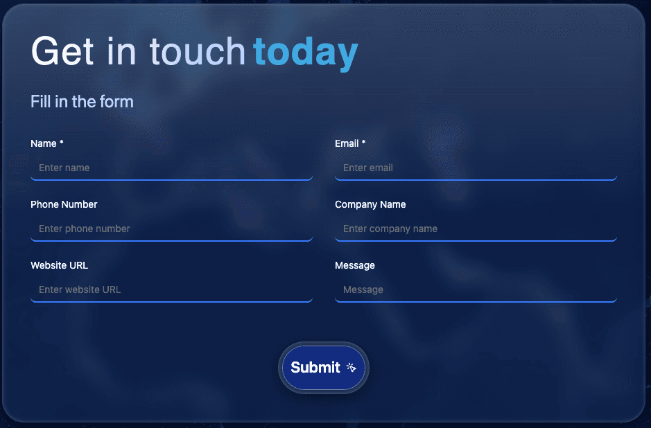
- Logical CTA placement for inquiries and contact
This structure made it intuitive for visitors to explore without feeling overwhelmed.
Step 3: UX/UI Design Execution
Once the brand direction and structure were defined, our design team moved into high-fidelity UI production.
Key UI techniques we used:
- Grid-based layouts: Ensured visual alignment and balance across all devices.
- Consistent spacing system: 8px baseline grid to maintain clean rhythm and proportional design.
- Dynamic imagery: Replaced generic stock photos with authentic visuals of factories, logistics hubs, and products — creating credibility.
- Motion & Microinteractions: Subtle fade-ins, parallax effects, and hover transitions brought pages to life without sacrificing performance.
- Typography hierarchy: Headlines in bold geometric sans-serif fonts (reflecting strength and precision), paired with elegant body text for readability.
- Color psychology: Used deep blues and neutrals to communicate trust and stability, accented by warm gradients to evoke innovation.
We also developed custom icons representing each service — giving the interface a signature visual language that felt uniquely OneLink Holdings.
Step 4: Design System & Handoff
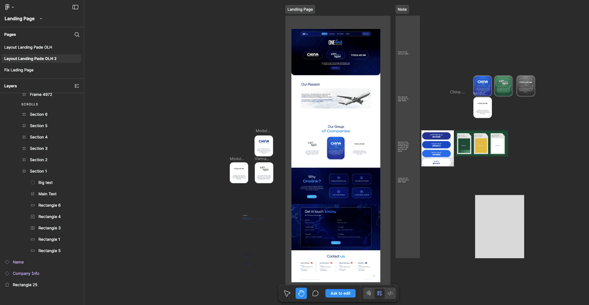
After final approval, we created a comprehensive design system in Figma to ensure scalability and consistency across all future brand touchpoints.
This included:
- A full UI component library (buttons, forms, cards, navigation states)
- Responsive grid specifications for desktop, tablet, and mobile
- Typography scales and color guidelines
- Reusable content blocks for future landing pages
This design system now serves as a long-term foundation for OneLink Holdings’ digital ecosystem — making updates faster and brand consistency effortless.
3. The Final Outcome
The new OneLink Holdings website is a complete transformation from a static information hub into a living, breathing brand experience.
- The homepage now tells a clear visual story — leading with bold imagery, crisp typography, and intuitive scrolling.
- Service pages balance technical depth with elegant simplicity, ensuring the brand feels premium but accessible.
- Custom iconography and real imagery reinforce the company’s credibility as an on-the-ground operator, not just a corporate entity.
- The unified color palette and grid structure ensure every page feels like part of the same brand family.
The redesign successfully repositioned OneLink Holdings as a modern, trustworthy, and globally-minded enterprise, reflects their evolution in the sourcing and logistics industry.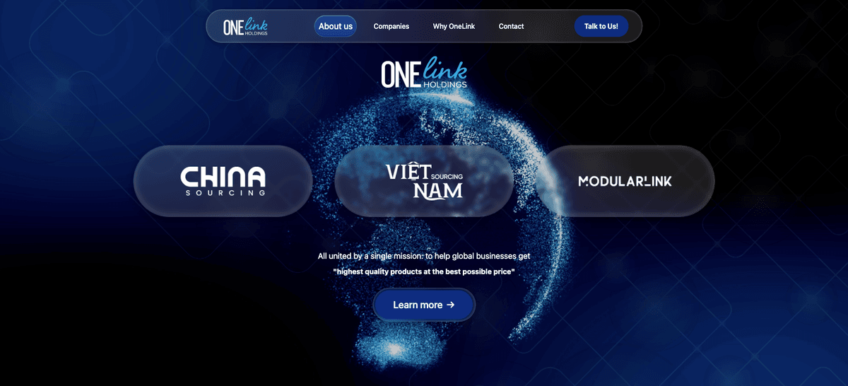
Key Design Highlights
Focus on Clarity: Every section communicates one key message — no clutter, no distractions. Global Feel: The new interface uses wide visuals, world maps, and movement lines to visualize connectivity. Scalable System: The Figma design system ensures brand coherence for all future websites and campaigns. Authenticity First: The use of real photography and videos from OneLink operations adds genuine storytelling power.
Conclusion
For growing enterprises like OneLink Holdings, a website is no longer just a digital brochure — it’s a brand stage. The redesign by OneLink Marketing did more than improve visuals; it elevated the company’s entire digital presence.
By combining visual storytelling, UX strategy, and brand consistency, OneLink Holdings now stands as a confident, globally recognizable name — ready for its next phase of growth.